UIC Website Redesign

A scalable, modern platform for an organization in its next chapter

Role. Project Lead — discovery and research, mood board and design direction, community team feedback sessions, user-centered prototyping, and high-fidelity Framer prototype. Built in close collaboration with UIC's Co-Founder and Executive Director, Sutton King.

Project Lead · Summer 2024–Spring 2025
Redesign of Urban Indigenous Collective's public-facing website.

UIC website redesign shown on MacBook

A GoDaddy site that outgrew itself

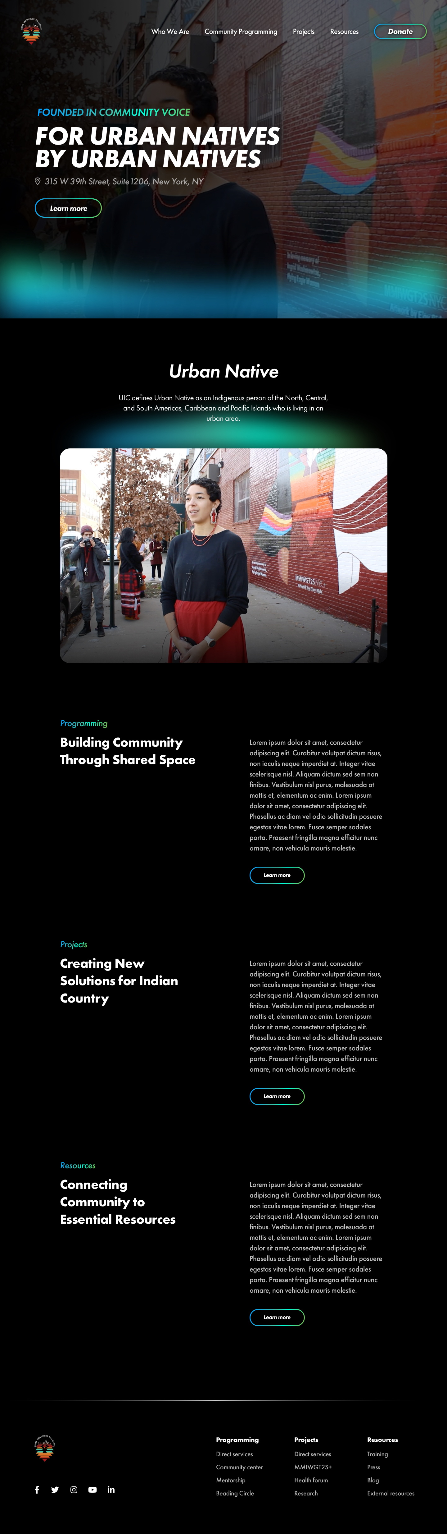
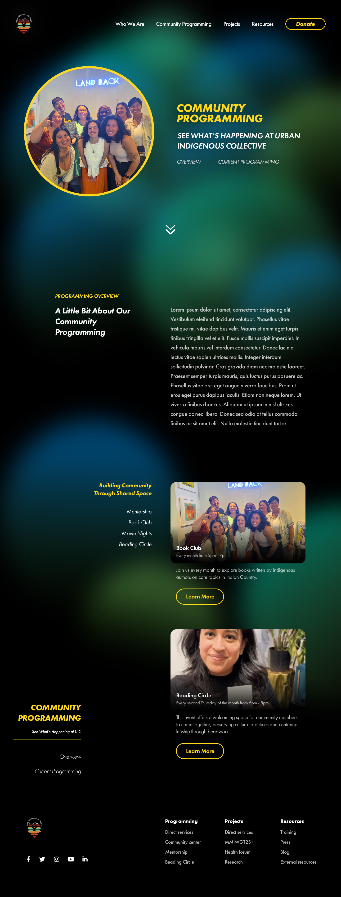
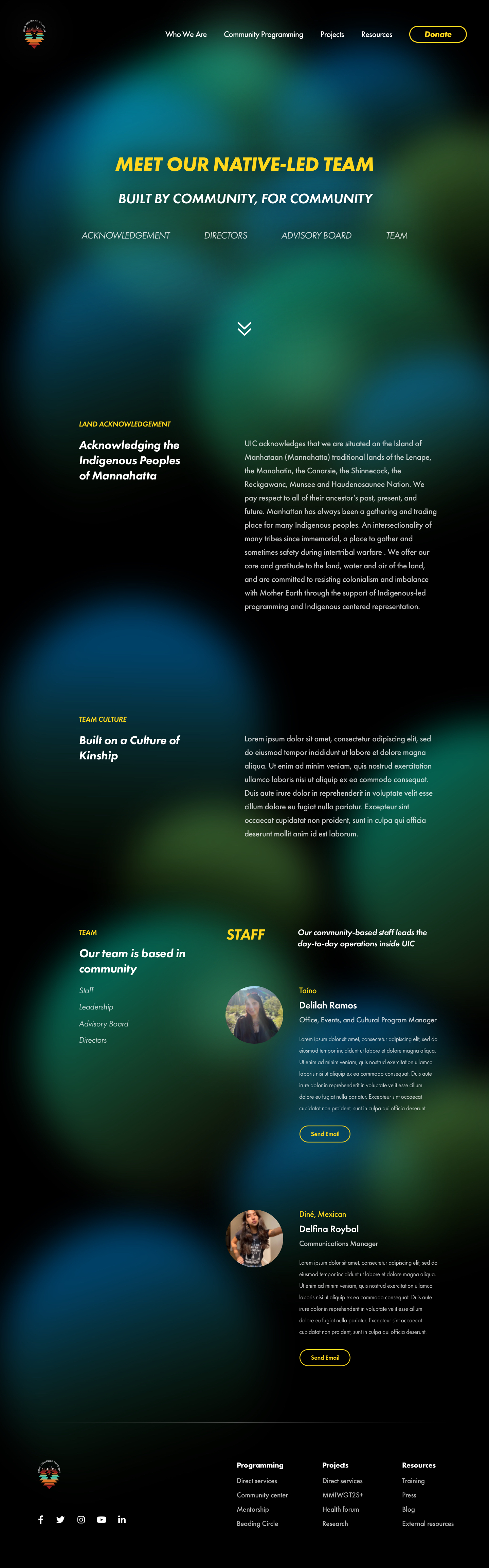
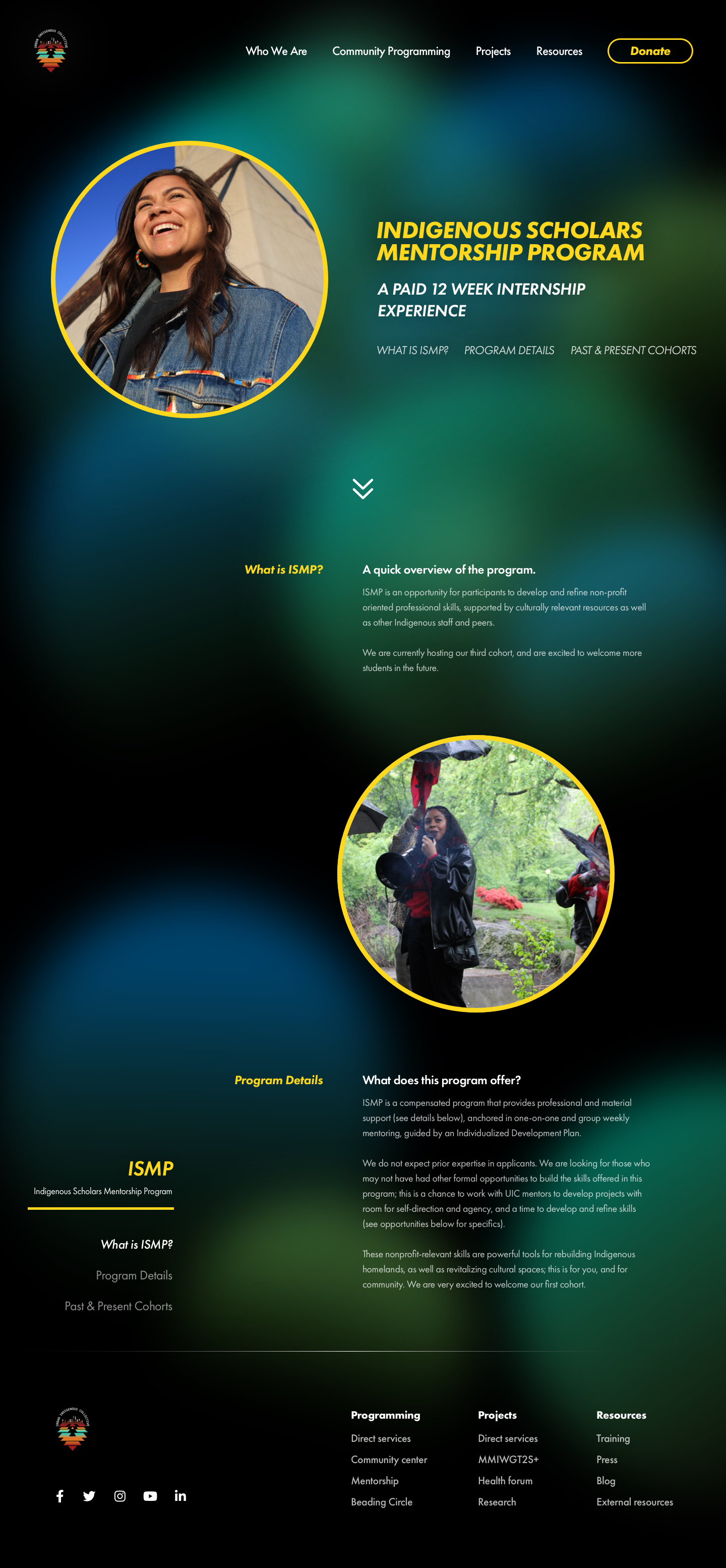
Since the organization's inception, Urban Indigenous Collective relied on a simple GoDaddy website to share programming and event details with the community. It served its purpose. But with the continued growth of UIC's community programming, the opening of a cultural center in midtown Manhattan, and the approach of their 5-year anniversary, the team recognized it was time for something that matched where the organization was going — not where it started.

The primary goals of the redesign were to create a scalable structure that could support continuous organizational growth, make it easy for the community to access resources, and deliver that experience through a modern, visually distinctive design that reflected UIC's identity and future vision.

Listening before designing

During the research phase, I held several check-ins with UIC's Co-Founder and Executive Director, Sutton King, to understand her vision and goals for the new site. We reviewed websites of other Indigenous organizations and nonprofits — including Illuminative — to build a mood board and establish shared references. It quickly became clear that the navigation structure needed a full rethink: what worked when UIC was smaller had become cumbersome as the organization grew.

After establishing the direction, I brought the full team together to surface their pain points with the existing site:

  • The Communications Manager noted that external press had difficulty locating the team page.
  • The Office, Events, and Cultural Program Manager highlighted the need for clearer donor pathways — how can small-dollar donors contribute, how can corporate sponsors get involved, and how can partner organizations support UIC's work?

Those pain points shaped the redesign's priorities directly. Navigational clarity and the donor experience weren't secondary — they were core design problems.

Improving navigation and organizational clarity quickly became the top priority — confirmed by every team member independently.

Three design decisions

UIC website home page redesign showing clean navigation and hero

Home — a clear entry point into UIC's identity and programs.

A rebuilt navigation system

The original navigation structure worked when UIC was smaller — but as programming expanded, it became a sprawling list that buried key information. The redesign reduced the top-level navigation to four clear categories: Who We Are, Community Programming, Projects, and Resources. Every page on the site maps to one of those anchors, giving visitors an immediate mental model of where to look — and making the addition of new programs a structural decision, not a navigation crisis.

UIC website category overview page showing scalable content architecture

Category overview — a scalable template for any programmatic area.

Content architecture built to scale

One of the clearest pain points from the existing site was that new programs and projects had no clear home. The redesign introduced a set of page archetypes — home, team, main content display, sub-category display, and text-only display — each derived from the site's newly organized sitemap. Each archetype is a reusable Framer template, so as UIC adds new programming, the site grows without requiring a new design for each addition.

UIC website team page showing community-centered design

Team — the community, front and center.

A design language rooted in identity

The visual direction emerged from two places: design observations made while working in the psychedelic plant medicine space with Sutton, and the evolving design language already being built for UIC's marketing materials. The result is a dark, rich aesthetic with layered gradients and warm accent colors — contemporary and distinctly Indigenous rather than generic nonprofit. It communicates both the gravity of UIC's mission and the vitality of the community it serves.

Selected screens

High-fidelity prototypes built in Framer — each derived from the site's newly organized sitemap.

A platform for UIC's next chapter

The redesign was completed as a high-fidelity Framer prototype spanning every key page archetype, the full navigation system, and the visual design language. It was delivered as part of UIC's 5-year anniversary milestone.

Production implementation was paused when funding for the build did not materialize — but the prototype stands as a complete, production-ready design specification, ready to ship when the resources are in place.

5 page archetypes 4-item navigation Framer prototype 5-year anniversary milestone Community-informed design

Built with

High-fidelity prototyping and design was completed in Framer. Initial wireframes and design system components were built in Sketch.

Sketch
Framer

What's next

The prototype is complete and the design vision is fully specified. The path forward is production implementation in Framer — building each page from the archetypes developed during the redesign. When UIC secures funding for the build, the site is ready to ship: every design decision has been made, every archetype is documented, and the visual system is defined. It's purely an implementation effort.